Philips Consumer Electronics catalogue
An innovative online catalogue based on 'Sense & Simplicity'.


In 2006 the Philips Electronics Consumer Electronics products didn't reflect the new 'Sense & Simplicity' corporate message and company slogan. The products we're almost randomly presented, demanding huge insight of the user who wanted to select a product. The homepage of Philips.com only showed a search bar, a baby and the brand. The online concept of philips.com was over-simplified and did not work well, because of the complexity of the diversified organization.
To counter this 'let's leave everything out, just show a search bar' thinking, I designed an alternative and interactive website, based on a real-time product selector with a horizontal sliding bar and vertically with radio buttons representing product attributes. To illustrate what ‘sense and simplicity’ really is from a consumers perspective. Making product choices simple, effective and attractive. "Designed around the consumer" as Philips proclaimed.
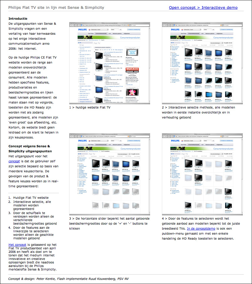

This was the original overview webpage of all Philips consumer television sets. Arranged in a long list of images, all with the same size. Although the tv's were very different in size.
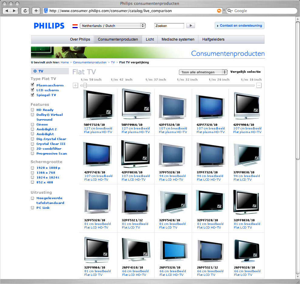
In my proposal the tv's are arranged in an array, with the features next to the photo's and the size bar on top.
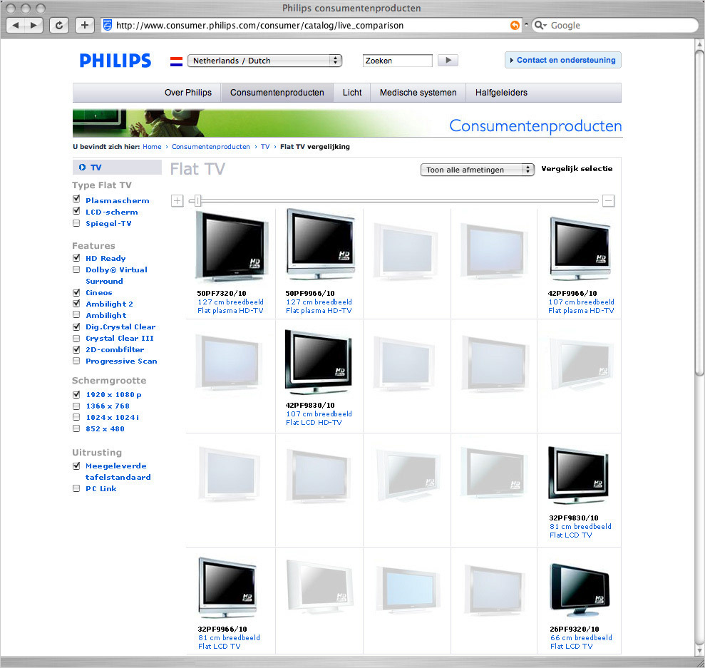
If the consumer selects the size range and features, the selected tv's are shown in full clarity, dimming the rest of the products that not fit the criteria. So that is sense and simplicity in real world application.